Bar chart/ Bar graph là một trong các dạng bài quen thuộc nhất trong phần thi IELTS Writing Task 1. Thuộc cùng nhóm với các loại biểu đồ khác như Line Chart, Pie Chart và Table, cách viết Bar Chart có những điểm tương đồng và cũng có các khác biệt riêng. Bài viết này sẽ cung cấp cho bạn cách viết Writing Task 1 Bar Chart chi tiết và rõ ràng nhất, giúp bạn có được sự tự tin khi giải quyết dạng bài Bar Chart.
Nội dung chính
1. Tổng quan về IELTS Writing Task 1 Bar Chart
1.1. Giới thiệu
Bar Chart là dạng biểu đồ bao gồm các thanh chữ nhật có chiều dài hoặc chiều cao tỷ lệ với giá trị mà chúng biểu thị. Các thanh có thể được vẽ theo chiều dọc hoặc chiều ngang. Trục hoành của Bar Chart đôi khi còn được gọi là một biểu đồ đường riêng biệt.
1.2. Chức năng
Chức năng chính của biểu đồ cột là so sánh, đối chiếu. Độ dài hay độ cao của các cột biểu thị giá trị của các yếu tố. Nhìn vào hình dạng các thanh chữ nhật, bạn có thể có được cái nhìn khách quan về giá trị lớn nhất, nhỏ nhất. Các hạng mục được so sánh trong biểu đồ có thể chỉ có một hoặc nhiều yếu tố. Biểu đồ càng phức tạp thì các hạng mục so sánh càng nhiều.
1.3. Yêu cầu chung
Cũng như các dạng bài về những biểu đồ khác của WRITING TASK 1, khi phân tích biểu đồ bar chart chúng ta ghi nhớ những yêu cầu chung sau đây nhé:
- Miêu tả, phân tích các đặc điểm số liệu một cách khách quan nhất. Điều này có nghĩa chúng ta tránh đề cập những quan điểm cá nhân hay những thông tin không được nhắc đến trong câu hỏi khi làm bài tập này.
- So sánh và làm nổi bật những xu hướng và đặc tính của đối tượng đang phân tích.
- Tránh liệt kê các số liệu nhé. Làm như vậy, bài viết sẽ dài dòng và không đáp ứng được yêu cầu đề bài.
- Bố cục rõ ràng. Ngôn ngữ linh hoạt. Ngữ pháp phong phú.
2. Phân loại
2.1. Bar chart có năm tháng
Khái niệm
Đối với Pie Chart hoặc Bar Graph có yếu tố thời gian, thì các bạn sẽ coi 2 biểu đồ này như là Line Graph, tức là sử dụng các cấu trúc chỉ sự tăng trưởng lên xuống và trends.
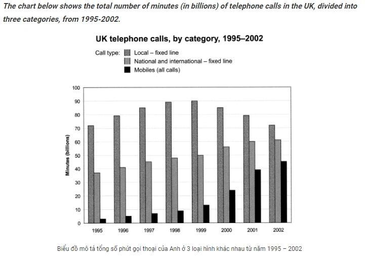
Đây là loại biểu đồ mà đối tượng biến thiên theo thời gian. Khi gặp dạng biểu đồ này, chúng ta nên nhớ nêu bật các xu hướng biến đổi theo thời gian nhé.
Ví dụ
Nhìn vào biểu đồ này, chúng ta lưu ý những đặc điểm sau:
- Số liệu khởi đầu (năm 1995)
- Số liệu sau cùng (năm 2002)
- Xu hướng thay đổi của các đối tượng trong vòng 8 năm này.
Cụ thể như sau nhé
- Local fixed line remained the most popular among all three categories in the UK during 1995-2002.
- National and international-fixed line was going more popular. In 8 years, the line was used almost twice in 2002 compared to in 1995.
- Most noticeable, mobile line usage increase significantly, about 9 times.
Mẫu thân bài tham khảo:
The quantity of national and international call making during this time in the UK was about 36 billion minutes in 1995 and swelled gradually to about 60 billion minutes in 2002, approximately two times higher than that of 1995. Meanwhile, mobile call showed the same trend. The number of calls went up significantly from only about 2 billion minutes in 1995 to about 45 billion minutes in 2002 and outlined a dramatic rise, in fact, almost 28 times higher than in 1995.
In contrast, the number of local calls fluctuated over the times observed. It was about 71 billion in 1995 and rose modestly to about 90 billion in 1998. The figure levelled off and began to go down in 2002 and remained falling significantly until 2002 when the figure hit about 71 billion. Nevertheless, the local – fixed line was true as the highest phone call made among other lines. The popularity of cell phone calls increased steadily over the period.
2.2. Bar chart không có năm tháng
Chú ý khi viết bài
- Điểm số liệu cao nhất trên biểu đồ
- Điểm số liệu thấp nhất trên biểu đồ
- Các điểm đặc biệt khác (điểm giao nhau, …)
Đối với dạng biểu đồ này, việc so sánh cũng được tiến hành khác hơn một chút so với biểu đồ năm tháng. Thay vì miêu tả xu hướng theo thời gian, chúng ta có thể tập trung làm rõ những khác nhau của các đối tương. Các bạn cùng phân tích ví dụ sau nhé:
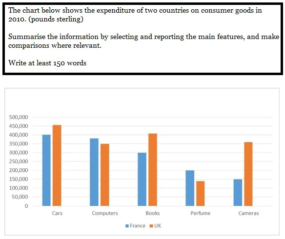
Ví dụ này so sánh mức tiêu dùng vào các sản phẩm như xe, sách, máy ảnh, máy tính và nước hoa ở Anh và Pháp.
Cần chú ý:
- Điểm cao nhất (trong ví dụ này là spending in Cars)
- Điểm thấp nhất (Perfume for UK and Cameras for France
- Những đặc điểm chênh lệch. Ví dụ như, cars, books and cameras was bought more in UK. Những thứ còn lại thì được tiêu thụ nhiều hơn ở Pháp.
Ví dụ
In terms of car, people in the UK spent about £450,000 on this as apposed to the French who spent £400,000. Similarly, the British spent more money on books than the French (around £400,000 and £300,000 respectively. In the UK, expenditure on cameras (just over £350,000) was double that of France, which was only 150,000.
On the other hand, the amount spent on the remaining goods was higher in France. Above £350,000 was spent by the French on computers which was slightly more than the British who spent exactly £350,000. Neither of the countries spent much on perfume which accounted for £200,000 of expenditure in France but under £150,000 in the UK
2.3. Biểu đồ có nhiều hơn 2 đối tượng
Ví dụ
Bài này mặc dù có năm 2009 tuy nhiên nó là biểu đồ Bar chart không có yếu tố thời gian. Vì vậy, các bạn không được dùng các từ vựng dành riêng cho Line graph vào bài này nhé!
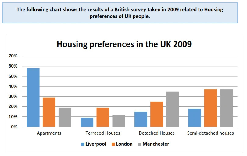
Phân tích đề
- Cách 1: chia theo đối tượng (Ví dụ như: Liverpool, London và Manchester).
Cách 1: Phân tích theo đối tượng:
Đoạn 1: Phân tích tỉ lệ chọn nhà ở Liverpool và Manchester. Phần lớn người dân ở Liverpool chọn sống ở apartments (60 %), hơn gấp 3 lần so với ở Manchester (20 %). Teraced houses là sự lựa chọn ít phổ biến nhất ở cả 2 thành phố. Sự lựa chọn detached và semi-detached houses ở Liverpool thấp hơn ở Manchester.
Đoạn 2: Phân tích tỉ lệ chọn nhà ở London. Ngược lại nhà ở semi-detached houses lại London lại cao nhất (40%). Apartments và detached houses là những lựa chọn phổ biến tiếp theo. Thấp nhất vẫn là terraced houses.
Xem thêm: Bài mẫu chủ đề: talk about your school
Cách 2: Phân tích theo đơn vị so sánh
Đoạn 1: Tỉ lệ lựa chọn apartments và terraced houses
Tỉ lệ người chọn aparment ở Liverpool là cao nhất (60 %), gấp 2 lần so với London và gấp 3 lần so với Manchester. Terraced houses là ít phổ biến nhất trong cả 3 thành phố. Terraced house phổ biến nhất ở London (20 %), cao gấp 2 lần so với 2 thành phố còn lại.
Đoạn 2: Tỉ lệ chọn nhà ở detached và semi-detached houses
Tỉ lệ chọn detached housed phổ biến nhất ở Manchester, cao hơn 2 thành phố còn lại. Semi-detached houses phổ biến như nhau ở London và Manchester, cao gấp đôi so với Liverpool.
Bài mẫu
Cách 1
As can be seen from the chart, nearly 60% of respondents to the survey in Liverpool preferred apartments, nearly three times as much as that of Manchester. However, the opposite tendency could be seen in the figures for detached houses and semi-detached houses, accounting for around 16% and well over 30% respectively. In contrast, there was just roughly 10% of residents in both cities choosing Terraced houses in 2009.
Regarding the survey result in London, well over a third of the preferences went on Semi-detached houses. This was followed by nearly 30% and 25% of citizens choosing Apartments and Detached houses respectively. Meanwhile, the figure for terraced houses was lower, with slightly less than 20% of survey participants selecting them.
Cách 2
As can be seen from the chart, nearly 60% of respondents to the survey in Liverpool preferred flats, almost doubling and tripling that of London and Manchester respectively. In contrast, Residing in Terraced Houses was a much less popular choice, accounting for just under 20% of survey respondents in London and around 10% in Manchester and Liverpool.
Looking at the chart in more detail, there was an equal proportion of citizens choosing Semi- detached houses in London and Manchester with well over a third of survey participants, which was twice as high as the figure for Liverpool with only 17%. Meanwhile, the percentage of residents choosing detached houses in Manchester was roundly 35%, which was about 10% and 20% higher than in comparison with that of London and Liverpool respectively
3. Hướng dẫn cách viết Writing Task 1 Bar Chart
3.1. Phân tích đề – bước quan trọng nhất trong cách viết Writing Task 1 Bar Chart
Các bước thực hiện
Đối với bất kỳ dạng bài nào trong Writing IELTS nói chung và riêng phần Task 1, phân tích đề là một bước vô cùng quan trọng và bắt buộc phải làm nếu bạn muốn đạt band điểm cao.
Với biểu đồ cột, quá trình phân tích đề bao gồm các bước sau:
- Bước 1: Nhìn vào biểu đồ, xác định xem biểu đồ có sự thay đổi về thời gian hay không.
- Bước 2: Xác định trục hoành và trục tung của biểu đồ biểu thị cho hạng mục gì. Tuyệt đối không đọc kỹ các yếu tố, chỉ xác định nhân tố biểu thị.
- Bước 3: Đếm xem có bao nhiêu cột trong biểu đồ, cột nào cao nhất, cột nào thấp nhất, cột nào giữ nguyên giá trị. Đối với dạng biểu đồ có thời gian, cố gắng tìm xu hướng tăng giảm của các yếu tố. Từ đó lên dàn ý phù hợp cho bài viết.
- Bước 4: Tiến hành viết bài, phân chia thời gian phù hợp cho các phần.
Ví du minh hoạ
“The graph shows estimated oil production capacity for several Gulf countries between 1990 and 2010.
Summarise the information by selecting and reporting the main features, and make comparisons where relevant.
- You should write at least 150 words.
- You should spend about 20 minutes on this task.”
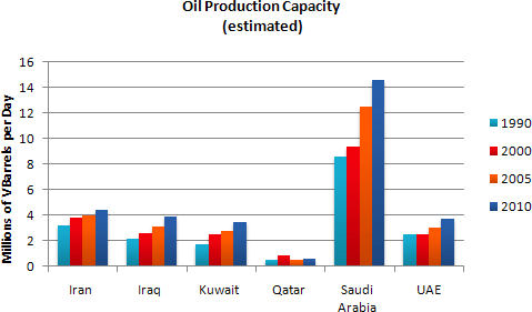
Từ đề bài trên, ta có thể phân tích đề như sau:
- Có thể thấy biểu đồ có sự thay đổi về thời gian, cụ thể 4 mốc thời gian chính được đề cập đến là: năm 1990, 2000, 2005 và 2010.
- Trục tung của biểu đồ biểu thị lượng dầu sản xuất được (đơn vị: triệu thùng). Trục hoành của biểu đồ biểu thị sáu quốc gia. Mỗi quốc gia gồm 4 cột màu, tương ứng với 4 năm được đề cập.
- Nhìn qua biểu đồ, có thể thấy các cột ở mỗi quốc gia đều có xu hướng cao lên qua 4 năm (trừ nước Qatar gần như không thay đổi). Các cột ở nước Saudi Arabia luôn cao nhất trong 4 năm. Ngược lại, các cột tại nước Qatar luôn ở mức thấp nhất trong 4 năm.
Như vậy, bạn đã có cái nhìn rõ ràng và khách quan nhất về biểu đồ. Từ đó, bạn có thể dựng được dàn bài phù hợp nhất cho đề bài. Phân tích đề là bước vô cùng quan trọng trong cách viết Writing Task 1 Bar Chart.
Xem thêm: Bài mẫu chủ đề: talk about your holiday
3.2. Lập dàn ý trong cách viết Writing Task 1 Bar Chart
Các bước lập dàn ý
Sau khi giành từ 1 đến 2 phút phân tích đề, bạn nên tiến hành lập dàn ý (trong khoảng 2 đến 3 phút). Do cấu trúc của bài Writing Bar Chart cũng tương tự với các dạng khác trong Task 1 IELTS (bao gồm 3 phần chính: Introduction, Overview, Body), phần lập dàn ý sẽ chủ yếu dành cho phần Overview và Body.
- Overview: Luôn ưu tiên các xu hướng tăng giảm trong biểu đồ. Nếu biểu đồ không có thời gian, hãy chú ý tới các giá trị lớn nhất và nhỏ nhất trong biểu đồ.
- Body: Phần Body luôn gồm hai đoạn nhỏ. Bạn có thể chia bài viết theo hướng so sánh các hạng mục với nhau, hoặc so sánh hạng mục theo các năm với nhau.
Ví dụ
Với ví dụ đề bài nêu trên, bạn có thể lập dàn ý theo gợi ý dưới đây:
- Overview: 5/6 quốc gia có xu hướng tăng lượng sản xuất dầu trong thời gian từ 1990 – 2010. Riêng lượng dầu của Qatar có xu hướng giữ nguyên
- Body
Body 1: Saudi Arabia và Iran
Năm 1990: Lượng dầu của Saudi Arabia cao nhất, tiếp đó là đến Iran. Từ năm 1990 đến 2010: lượng dầu của hai quốc gia đều có xu hướng tăng. Nếu Saudi Arabia tăng mạnh (từ 8.5 đến 14.5 triệu thùng) thì lượng dầu của Iran tăng chậm hơn (chỉ tăng khoảng 1.5 triệu thùng). Trong suốt 4 năm, Saudi Arabia có lượng dầu sản xuất ra lớn nhất trong 6 quốc gia
Body 2: Iraq, Kuwait và UAE; Qatar
Năm 1990, Iraq, Kuwait và UAE có lượng dầu xấp xỉ nhau (2 triệu thùng). Lượng dầu của 3 quốc gia này có xu hướng tăng nhẹ (khoảng 1 triệu thùng) trong vòng 20 năm. Trong khi đó, năm 1990, lượng dầu của Qatar chỉ dừng lại ở mức 0.5 triệu thùng. Sau đó, lượng dầu của quốc gia này gần như không đổi cho đến năm 2010.
3.3. Viết bài Writing Task 1 Bar Chart
Sau khi đã lập được dàn ý, bạn có thể bắt tay ngay vào việc viết bài. Khi thi thật, thời gian bạn nên dành cho phần viết bài chỉ kéo dài khoảng 15 phút (trong tổng số 20 phút).
Introduction
Với phần Introduction, bạn chỉ đơn giản paraphrase lại đề bài bằng từ ngữ của mình. Có hai cách paraphrase phổ biến:
Word by word: khi paraphrase theo cách này, bạn chỉ cần thay thế từng từ trong đề bài bằng từ đồng nghĩa.
Ví dụ, với đề bài trên, ta có thể paraphrase như sau:
- The graph = The bar chart
- shows = indicates
- estimated oil production capacity = the estimated amount of produced oil
- for several Gulf countries = for 6 Gulf nations
- between 1990 and 2010 = in the period of 1990 – 2010
New Structure: với cách paraphrase này, bạn có thể thay đổi cấu trúc chủ vị, chủ động – bị động của đề bài, miễn là ý nghĩa của đề bài không bị thay đổi.
Ta có thể paraphrase lại đề bài trên theo cách New Structure như sau:
“The bar chart reveals how much-estimated oil produced in 6 Gulf countries from 1990 to 2010”.
Overview
“Overall, it is clear from the chart that the capacity of produced oil in Qatar remained unchanged over the span of 5 years. However, other nations witnessed a climb in the amount of generated oil.”
Body
Từ dàn ý trên, bạn có thể xây dựng phần thân bài cho bài viết của mình. Cụ thể:
Body 1:
- Ý 1: In 1990, the daily number of produced oil barrels in Saudi Arabia reached 8.5 million, followed by the second position, Iran with 3 million barrels.
- Ý 2: After 20 years, while the oil production amount of Saudi Arabia increased dramatically to 14.5 million barrels per day, that of Iran saw a growth of around 1.8 million barrels.
Body 2:
- Ý 1: Iraq, UAE and Kuwait had the similar oil amount in 1990 (around 2 million barrels a day) and experienced a slight climb in oil capacity when they respectively peaked about 4, 3.8 and 3.5 million barrels per day till 2010.
- Ý 2: However, the number of produced oil barrels in Qatar was only 0.4 and stayed unchanged after 20 years.
Trong phần viết này, bạn có thể lưu ý một số cấu trúc và từ vựng:
- N + V, followed by + N: cấu trúc so sánh
- While + N + V, N + V: dùng để diễn tả 2 vế mang tính chất tương phản
- See a growth: diễn tả xu hướng tăng
- Experience a climb: diễn tả xu hướng giảm
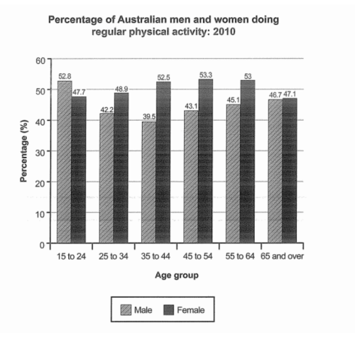
“The bar chart below shows the percentage of Australian men and women in different age groups who did a regular physical activity in 2010.
The chart compares the proportions of Australian males and females in six age categories who were physically active on a regular basis in the year 2010.
Roughly speaking, close to half of Australian adults did some kind of routine physical activity in 2010. Middle-aged females were the most physically active, proportionally, while males aged 35 to 44 did the least physical activity.
In the youngest age category (15 to 24), almost 53% of Australian men but only 47.7% of women did regular physical activity in 2010. However, between the ages of 25 and 44, men were much less active on average than women. In fact, in the 35 to 44 age group, a mere 39.5% of males did some form of regular exercise, compared to 52.5% of females.
Between the ages of 45 and 64, the figure for male physical activity rose to around 45%, while the proportion of active females remained around 8% higher, at 53%. Finally, the percentages of Australian women and men aged 65 and over who exercised regularly were almost identical, at approximately 47%.”
Xem thêm: Bài mẫu chủ đề: talk about your job
Trong phần thi viết IELTS bạn nên chú trọng từ vựng, ngữ pháp, cả dấu chấm câu thật chỉnh chu. Chú ý viết ngắn gọn, cụ thể, rõ ràng ý muốn diễn đạt. Đặc biệt, nếu muốn đạt điểm cao hãy sử dụng từ linh hoạt, đa dạng để diễn đạt những ý giống nhau. Nếu không thể tự luyện tại nhà, bạn có thể tham khảo khóa học IELTS uy tín để được thầy cô hướng dẫn và chỉnh sử bài viết tốt nhất nhé.
4. Một số cấu trúc và cụm từ thường được sử dụng trong bài viết Writing Task 1 Bar Chart
Từ vựng dùng cho bài viết Writing Task 1 Bar Chart
| Ý nghĩa | Từ vựng |
| Diễn tả xu hướng tăng | To grow/ increase/ rise/ climbTo experience/ to record/ to see a growth/ an increase/ a rise/ a climb in… |
| Diễn tả xu hướng tiếp tục tăng/ giảm | To continue its upward/ downward trend |
| Diễn tả xu hướng đạt điểm cao nhất | To reach/ hit the peak/ highest point of … / To peak at… |
| Diễn tả xu hướng chạm điểm thấp nhất | To reach/ hit the lowest point/ the bottom/ a trough of… |
| Diễn tả xu hướng giữ nguyên | To remain/ to stay unchanged/ stable/ consistent/ constant/ the sameTo stabilize/ to flatten out/ to level out/ off/ to reach a plateau of/ to maintain the same level/ stand at… |
| Diễn tả mức độ thay đổi của xu hướng | Nhẹ: slight/ modest/ moderateMạnh: dramatic, considerable, sharp, significant, substantial, remarkable, astronomical, enormous, marked |
| Các từ diễn tả số lượng | The amount of / the quantity of N (danh từ không đếm được)The number of/ the quantity of N/ the figures for N (danh từ đếm được) |
| Các cụm từ miêu tả xu hướng trong tương lai | To be expected/ projected/ predicted/ likely to V |
| Các cụm từ diễn tả so sánh gấp | The number doubled/trebled/quadrupled between … and … (gấp đôi, gấp ba, gấp bốn)There was a two-fold increase between … and … (tăng gấp đôi)The figure in 1994 was twice/ 3 times/ 4 times the 1992 figure (gấp hai, gấp ba, gấp bốn)The figure fell by one fifth/ a half/ two fifths (giảm một phần năm, một nửa, hai phần năm) |
Cấu trúc cho bài viết Writing Task 1 Bar Chart
- There + to be + data + of + N
Ví dụ: There is more than 50% of 15-year-old boys playing badminton in their leisure time.
- The amount/ number/ quantity/ proportion… + of + N + to be + data
Ví dụ: The percentage of females in Brazil playing badminton in their leisure is approximately 50%.
- So sánh nhất, at/ with + data
Ví dụ: The percentage of animals in Brazil is the highest, with 30%.
- Data + to be + the amount/ number/ quantity/ proportion… + of + N
Ví dụ: 50% is the percentage of females in Brazil playing badminton in their leisure time.
- Clause, followed by + Noun Phrase
Ví dụ: There was a slight increase in the number of animals in Brazil in 1997, followed by a dramatic decrease after 10 years.
- X verb, Verb-ing, (which verb)
Ví dụ: The number of animals in Brazil increased to 30,000 in 1997, exceeding the quantity in Poland, which had only 12,000.
- The highest/ greatest/ lowest percentage/ proportion/ number/ quantity… / of + N + to be/ V + N
Ví dụ: The lowest number of animals in 1997 was in Brazil.
- N + to be + the most/ least common/ popular…. + N
Ví dụ: Japan is the most popular nations for politicians in 1990.
- (Far/ Much/ Many/ Considerably/ Significantly/ Dramatically…) + more + N + to be/ V + than …
Ví dụ: Far more boxes are made in Poland than in Austria.
5. Các lỗi thường gặp và lưu ý trong cách viết Writing Task 1 Bar Chart
5.1. Không xác định dạng bài
Việc xác định dạng bài trong Bar Chart vô cùng quan trọng. Nếu Bar Chart có thời gian, bạn cần phải so sánh và đối chiếu để làm nổi bật sự biến đổi về giá trị của từng hạng mục qua các năm, tuyệt đối không được liệt kê từng năm hoặc từng hạng mục riêng lẻ. Một bí kíp để làm dạng Bar Chart có thời gian là hãy coi đề bài tương tự như một bài tập dạng Line Chart (khi bạn nối các cột trong Bar Chart, bạn sẽ có một biểu đồ đường mới).
5.2. Không dùng từ nối
Một trong các tiêu chí chấm điểm trong IELTS Writing Task 1 nói chung là Coherence and Cohesion (Độ mạch lạc của bài viết). Và việc không dùng từ nối sẽ khiến cho bài viết của bạn trở nên rời rạc, thiếu liên kết.

Trong Task 1, bạn không cần thiết phải đưa quá nhiều từ nối. Các từ đơn giản, thông dụng nhưng vẫn khiến bài viết của bạn chuyển ý thật mượt mà như: Meanwhile, However (Dùng để nối hai câu tương phản); Subsequently, Similarly (Dùng để nối hai câu nghĩa tương đương), Interestingly, Strikingly, It is interesting that…, It is striking that…, The interesting point is that…, (Dùng để chỉ ra đặc điểm nổi bật).
Xem thêm: Bài mẫu chủ đề: talk about yourself – IELTS Speaking
5.3. Dùng sai từ miêu tả số lượng
Khi miêu tả Bar Chart nói riêng hay các biểu đồ tương tự khác (Line Chart, Pie Chart, Table), bạn thường xuyên phải sử dụng các từ miêu tả số lượng.
Lỗi sai phổ biến là dùng không đúng từ miêu tả số lượng với danh từ đếm được hoặc không đếm được. Ví dụ: The number of sugar, The amount of cups,… Bên cạnh đó, việc chia sai động từ cũng thường xuyên xảy ra khi thí sinh không nắm rõ được đâu là danh từ đếm được, đâu là danh từ không đếm được.
6. Bài mẫu IELTS Writing Task 1 Bar chart
6.1. Bài mẫu IELTS Writing Task 1 Bar Chart #01
The chart shows the average daily minimum and maximum levels of air pollutants in 4 cities 2000.
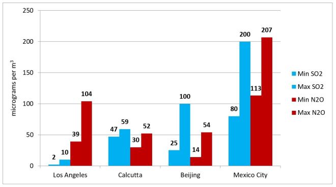
The given bar chart presents the daily minimum and maximum levels of SO2 and N2O which caused pollution in 4 different cities (Los Angeles, Calcutta, Beijing and Mexico City) in the year 2000. Overall, Mexico City was by far the most contaminated by the two mentioned pollutants among the four cities.
In Los Angeles, the quantity of SO2 emitted into the atmosphere was the lowest of all cities, with a minimum average of 2 micro-grams per m3 and a maximum average five times as much, at 10 micro-grams. The levels of N2O emissions were much higher with the maximum daily average level reaching up to more than 100 micro-grams per m3. Meanwhile, the atmosphere in Mexico City was severely polluted by SO2 and N2O emissions with the daily minimum and maximum averages of 80 and 113 micro-grams per m3 respectively.
In contrast to Los Angeles and Mexico City, the amount of pollution caused by N2O in Calcutta and Beijing was less than that caused by SO2. The daily average maximum figures for SO2 emissions were 59 micro-grams per m3 in Calcutta and 130 micro-grams per m3 in Beijing while the average maximum figures for N2O were just over 50 micro-grams per m3 in both cities.
6.2. Bài mẫu IELTS Writing Task 1 Bar Chart #02
The chart shows the proportion of renewable energy in total energy supply in 4 countries from 1997 to 2010.
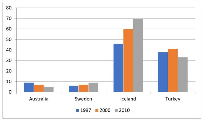
The given bar chart presents data about the percentages of renewable energy with regards to the total energy production in four different countries (Australia, Sweden, Iceland and Turkey) in three years; 1997, 2000 and 2010.
Overall, Sweden and Iceland witnessed an upward trend in the use of renewable energy sources in the three examined years. It can also be seen that among the four countries, this type of energy was most popular in Iceland.
In 1997, almost half of the total energy produced in Iceland came from renewable resources. This figure continued to climb steadily to 60% in 2000 and more than 70% in 2010. Meanwhile, in 1997, only approximately 5% of the entire amount of energy produced was generated from natural resources in Sweden, who experienced a similar trend to that of Iceland in regards to proportion of renewable energy produced.
Regarding Australia, nearly 10% of the energy supply was from renewable resources in 1997, and this figure decreased slightly to around 5% in 2010. Similarly, the percentage of renewable energy used in Turkey experienced a decline over the years from approximately 37% in 1997 down to just under 35% in 2010.
Xem thêm: Bài mẫu chủ đề: talk about the internet – IELTS Speaking
6.3. Bài mẫu IELTS Writing Task 1 Bar Chart #03
The chart below shows the number of films produced five countries in three years.
The bar chart provides information about movie production in five different countries (labelled A-E) from 2007 to 2009.
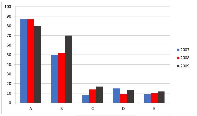
Overall, country A had the highest number of films produced. It is also notable that while there was a decline in the figures for country A and D, the opposite was true for those of country B, C and E.
In 2007, around 86 films were made by country A. The figure remained unchanged one year later before slightly decreasing to exactly 80 films in 2009. Starting at about 15 movies in 2007, the number of films released by country D fell to just under 10 in 2008 and rose again to 12 in 2009.
However, the opposite trend could be seen in the figures for the other countries. Between 2007 and 2009, the number of movies made by country B witnessed a rise of 20 movies from 50 films to 70 films. Similarly, despite standing at only under 10 films in 2007, the number of movies made by country C underwent a gradual increase to 18 movies by 2009. As for country E, the figure only experienced a minimal rise from around 9 movies in 2007 to 11 in 2009.
6.4. Bài mẫu IELTS Writing Task 1 Bar Chart #04
The bar chart below shows the percentage of government spending on roads and transport in 4 countries in the years 1990, 1995, 2000, 2005.
The given bar chart shows the proportion of government expenditure on road and transport in four countries (Italy, Portugal, UK, USA) every five years between 1990 and 2005.
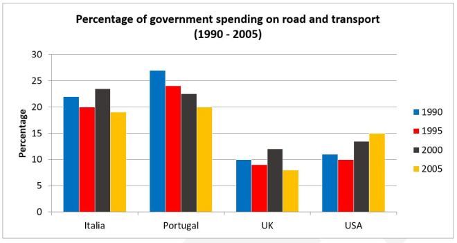
Overall, it can be seen that governments in mainland Europe spent far more money on roads and transport than those in the UK and USA. It is also clear that the UK spent the least amount of money on roads and transport in all measured years.
In 1990, Portugal spent the most amount of money on roads and transport at approximately 27%, followed by Italy at about 22%, while the USA and UK both spent only around 10% of their government budget. In 1995 however, all countries reduced their road and transport spending by between 1-3%.
By 2000 while Portugal continued to reduce its road and transport spending down to around 22%, Italy had increased its spending to approximately 23%, overtaking Portugal as the leading spender on transport infrastructure in 2000. The UK and USA had both increased spending in 2000 by about 3%. In 2005, all countries except USA further reduced their spending with Portugal, Italy, UK and the USA at 20%, 19%, 8% and 15% respectively.
Xem thêm: Bài mẫu chủ đề: talk about shopping – IELTS Speaking
6.5. Bài mẫu IELTS Writing Task 1 Bar Chart #05
The chart shows information about the actual and expected figures of the population in three cities, Jakarta, Sao Paulo, and Shanghai.
The given bar chart illustrates the population of Jakarta, Shanghai and Sao Paulo in 1990, as well as the estimated and actual figures of the populations in 2000.

Overall, the population figures were highest for Sao Paulo, while Jakarta had the lowest number of inhabitants. Also, there were significant differences in the predicted and actual figures for 2000 in all countries.
Starting at around 17 million people in 1990, the population of Sao Paulo, the most populous area of the three examined cities, was expected to rise by about 4 million over the next decade. Likewise, forecasts estimated that the figure for Jakarta would also experience an increase of 2 million to reach 11 million in 2000, while that of Shanghai would decrease slightly to 11 million people.
The actual figures, however, implied a considerable growth in the populations of all cities. To be specific, Sao Paulo’s population reached nearly 25 million after ten years, while there were about 3 million more residents in Jakarta. At the same time, Shanghai’s figure which was projected to decrease slightly turned out to soar to 15 million in 2000.
6.6. Bài mẫu IELTS Writing Task 1 Bar Chart #06
The bar chart details the amount of waste that was disposed via landfill, burning and dumping at sea, in a particular European country between 2005 and 2008.
Overall, it can be seen that while landfills initially were the main method of waste disposal and burning the least used method, the trend slowly reversed over the four-year period.
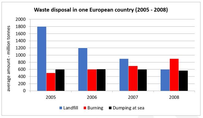
In 2005, disposing of waste via landfill was significantly the most preferred method of disposal with 1800 million tonnes of trash being buried. The amount of trash dumped at sea was only a third of this, at 600 million tonnes, while the amount of trash that was burnt was around 500 million tonnes. In 2006 the amount of waste buried in landfills had reduced substantially by 600 million tonnes, to 1200, however the amount of waste that was burnt or disposed of at sea only increased by 50-100 million tonnes.
In 2007, the waste the was buried and dumped at sea both dropped to about 900 and 600 million tonnes respectively, while the amount of trash burnt rose to around 700 million tonnes. By 2008, burning of waste was the preferred method of disposal, at 900 million tonnes, with landfill waste down to only 600 million tonnes, a third of the figure from four years earlier, and only approximately 550 million tonnes of waste dumped at sea.
Xem thêm: Từ vựng tiếng Anh về nhà bếp – 100+ dụng cụ nhà bếp
6.7. Bài mẫu IELTS Writing Task 1 Bar Chart #07
The bar shows the percentage of people going to cinemas in one European country on different days.
The chart illustrates the proportion of people visiting a cinema during seven days of the week in a European nation from 2003 to 2007.
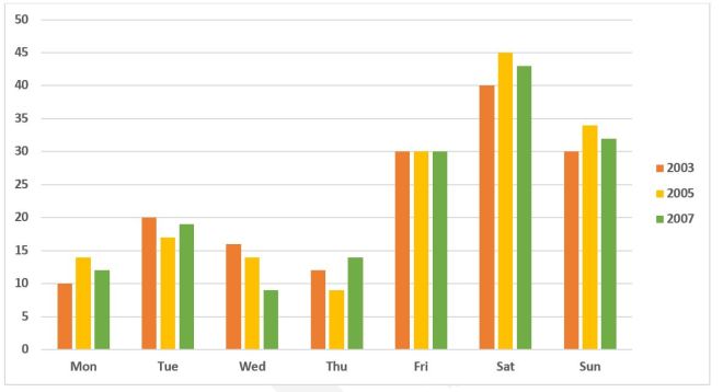
It is clear that there were only small fluctuations in people’s preference of which day to go to the cinema over the examined period. People in this country tended to go to the cinema on the weekend rather than on Monday to Friday.
In 2003, 40% of people went to cinemas on a Saturday, compared to 30% on Friday or Sunday each. On the other days, the proportion of movie-goers was higher on Tuesday, at 20%, while the lowest figure can be seen on Monday, at only 10%.
Over the next four years, the percentage of people going to the cinema on weekends increased slightly to 45% 35% for Saturday and Sunday respectively. Similarly, Thursday and Monday became more popular among cinema-goers, with about 2% more people choosing these days.
However, fewer people went to see movies on Tuesday and Wednesday, with the figures falling to 19% and 9% respectively. Finally, the proportion of movie-goers choosing to go to the cinema on a Friday remained at 30% during the three examined years.
6.8. Bài mẫu IELTS Writing Task 1 Bar Chart #08
The chart below shows the percentage of the population in the UK who consumed the recommended daily amount of fruit and vegetables in 2002, 2006 and 2010.
The chart illustrates the percentage of men, women and children who consumed the recommended amount of fruit and vegetables on a daily basis in three different years.
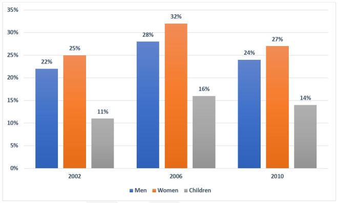
Overall, women came out first in term of fruit and vegetable consumption while the opposite was true for children.
In all three years, there was a small difference in the percentage of males and females who consumed enough fruit and vegetables every day. The highest figure for women was 32% in 2006 compared to 28% of men. 2010 witnessed the second highest rank for both women and men’s figures. While 27% of women consumed fruit and vegetables, the percentage of men was 24%. And the smallest figure for both women and men, which was nearly the same as the 2010 figures, was recorded in 2002.
The smallest percentage of people consuming the daily recommended amount of fruit and vegetables was children with only 11% in 2002, half as much as that of men and women in the same year. Following that, the figure for children slightly increased to 16% in 2006 before falling marginally to 14% in the last year.
Xem thêm: 10+ đoạn văn miêu tả đồ vật yêu thích bằng tiếng Anh
6.9. Bài mẫu IELTS Writing Task 1 Bar Chart #09
The chart shows changes in the shares of a car manufacturer’s sales in four regions (North America, South America, Europe, and Asia) between 2006 and 2010.
It is clear that the proportion of Asia sales was on the rise while that of the other markets either declined or fluctuated over the period shown. In addition, Asia and Europe remained the company’s major markets throughout the years.
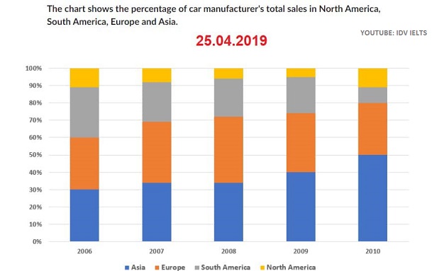
In 2006, North America represented just slightly over one-tenth of the total sales while three other regions made up significant proportions, at roughly 30% each. Two years later, the percentages of North America and South America dropped substantially to around 6% and 20% respectively. By contrast, sales in Europe reached a peak at 38%, making this region the largest market for two consecutive years (2007 – 2008).
Over the following two years, however, Asia overtook Europe as the company’s principal market, contributing up to half of its turnover in 2010. North America also regained its significance whereas South America’s sales plummeted to around 8% only, the lowest proportion that year.
6.10. Bài mẫu IELTS Writing Task 1 Bar Chart #10
The chart compares the proportions of cinema-goers on different days of the week (Monday to Sunday) in one European country in 3 different years (2003, 2005 and 2007).
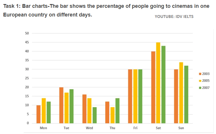
It is clear that the percentage of people going to the cinema on Friday, Saturday or Sunday was significantly higher than that on any other days (Monday to Thursday) during the period shown. In addition, most people went out for a film on Saturday, making it the busiest day of the week for cinemas throughout the years.
In 2003, only one-tenth of the country’s population went to the cinema on Monday compared to 40% on Saturday and 30% on either Friday or Sunday. By 2005, Thursday became the least preferred day to enjoy this leisure activity, with less than 10% of the people doing so. By contrast, the figures for Saturday and Sunday both hit a high of roughly 45% and 34% respectively.
In 2007, however, only Tuesday and Thursday saw an increase in the proportion of cinemagoers, with the latter experiencing a more sizable gain (5%). Particularly, the figure for Friday remained unchanged throughout the three years.
6.11. Bài mẫu IELTS Writing Task 1 Bar Chart #11
The chart illustrates the average class size in elementary and junior secondary schools of 6 different countries in comparison with the global average in 2006.
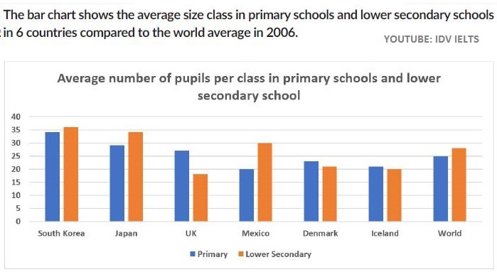
It is clear that in either stage of basic education, the number of students per class in the two Asian countries was significantly higher than the global average while that of either Nordic country was always lower. Noticeably, Mexico and the UK organized the smallest class size for primary schools and lower secondary schools respectively.
In terms of elementary education, schools in South Korea had the largest average class size, at 34 pupils, followed by Japan (29) and the UK (27). By contrast, the typical sizes of primary classes in Mexico, Denmark, and Iceland were all below the global average (25). Particularly, Mexico had the lowest figure with only 20 pupils per class.
With regard to lower secondary education, average class sizes in Mexico and the two Asian countries were above the world’s average (28) whereas Denmark and Iceland had significantly smaller classes, at around 20 students on average. The UK organized the smallest class size for this education level, with only 18 students per class.
6.12. Bài mẫu IELTS Writing Task 1 Bar Chart #12
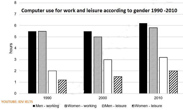
The chart compares the amount of time males and females used computers for work and relaxation in three different years (1990, 2000 and 2010).
It is clear that the number of hours both sexes spent on the computer for either purpose rose over the period shown. Remarkably, men used the device for leisure far more often than women in all 3 years.
In terms of professional purpose, both sexes spent almost equal amount of time working on the computer in 1990, at approximately 5.5 hours per day. By 2000, men worked on this device for the same number of hours daily while the figure for women dropped by half an hour. Ten years later, males and females spent considerably more time using the device for work, up to around 6.2 hours and 5.8 hours a day respectively.
With regard to leisure purpose, men spent almost twice as much spare time on the computer as women in 2000, at 3 hours and 1.5 hours per day respectively, and this was the largest difference in 3 years. By 2010, however, women used the device for recreation more often, a marked increase of half an hour daily, whereas men only saw a marginal rise of roughly 6 minutes.
6.14. Bài mẫu IELTS Writing Task 1 Bar Chart #14
The chart compares the popularity of various pastimes among men and women in England in 2006.
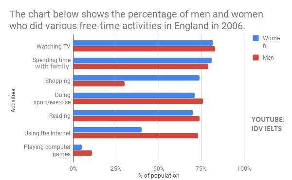
Overall, watching TV and spending time with family were the most popular leisure activities while playing computer games was the least favored by both males and females that year. In addition, shopping and using the Internet saw the most striking differences in preference level of the two genders.
More specifically, the majority of men or women in England (around 80%) preferred to watch TV or spend time with their family during their free time. Conversely, only 5% of females and slightly over 10% of the opposite gender enjoyed playing digital games.
Noticeably, sports and reading saw similar levels of preference by each gender, with approximately 70% of females and 75% of males practicing these hobbies. By contrast, the proportion of women who enjoyed shopping was more than double that of their male counterparts, at around 75% and 30% respectively. As for surfing the Internet, however, the figure for men was almost twice as much as that for women.
6.15. Bài mẫu IELTS Writing Task 1 Bar Chart #15
The bar chart below gives information about five countries’ spending habits of shopping on consumer goods in 2012. Summarise the information by selecting and reporting the main features, and make comparisons where relevant.
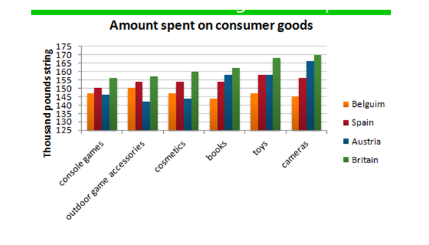
The chart compares the spending habits of shoppers in five European countries on six consumer products, namely console games, outdoor game accessories, cosmetics, books, toys and camera. Overall, more money was spent on the latter two than on any other product.
It can be observed that in Britain, the highest amount of money was spent on camera (more than 160 million pounds), while similar amounts were spent on console games and outdoor game accessories. The Austrian spent the second highest amount of money on the first three products while they stood last in the latter three. It is also revealed that Spanish spent more money on toys than on any other product (a bit less than £150 million), but they also paid a lot for camera. Finally, Belgian spent the least overall, having similar spending figures for all 6 products compared in the bar chart.
To sum up, the British were the biggest spenders in all six categories among the nations compared in the bar chart while the lowest spending levels were attributed to the residents of Belgium.
Xem thêm: 100+ câu chúc ngủ ngon bằng tiếng Anh hay nhất bạn cần biết
6.16. Bài mẫu IELTS Writing Task 1 Bar Chart #16
“The chart below gives information about “Istanbul Promo plus” sales in 2007. Summarise the information by selecting and reporting the main features, and make comparisons where relevant”
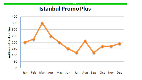
The chart shows how Promo Plus in Istanbul fluctuated over a period of 12 months. It is observed that in the first month of 2007, Promo Plus sales stood at 200 million turkish lira and rose slightly to reach about 225 million in February. This was followed by another increase, although much steeper, in March when sales where almost 125 million turkish lira higher than February.
However, this upward trend was suddenly broken and sales plummeted dramatically over the next 4 months to reach a little over 100 million turkish lira in July. August sales showed a significant rise back to January levels as figures nearly doubled, but this was not to last as they dropped again in September to the same level as they were in July. October came with a small increase of about 100 million turkish lira in sales, after which sales figures levelled off and remained relatively static over the last two months of 2007.
Overall, Promo Plus in Istanbul remained relatively unchanged in 2007 as January and December sales were fairly equal. Also, sales were at their highest in March while the weakest sales figures could be observed in July and September.
6.17. Bài mẫu IELTS Writing Task 1 Bar Chart #17
“The graphs below show the development of the cutting tools made by stone, one was made 1.4 million years ago, and the other was made 800 thousand years ago, viewing from back view, front view and side view. Summarize the information by selecting and reporting the main features, and make comparisons where relevant.”
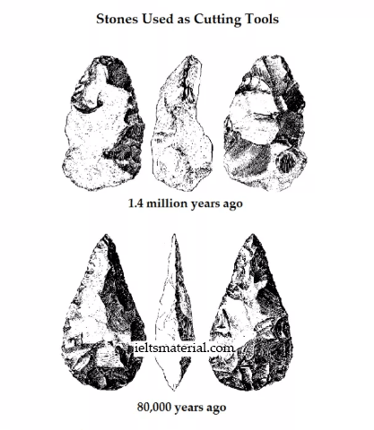
The given diagram illustrates the cutting stone tool and how it was advanced, from 1.4 million years ago to 800 thousand years ago. It can be clearly seen that the stone tool was improved into a sharper and better one, over the years.
The stone tool made 1.4 million years ago was more rounded at the top and bottom edges. From the front and the back view of the tool it is clear that the diameter in the middle was almost 5 cm and towards the top and bottom, it was around 3 cm wide. The side view shows that the tool was wider in the middle, with a diameter of around 3 cm and it tapered towards the top and the bottom ends. The back of the stone had fewer cuts than the front and they were also not very fine.
800 thousand years ago, this tool developed into a sharper, more refined tool. In the front and the back view it can be seen that the maximum diameter of the tool was the same as in the older tool, but it was more towards the lower side. The bottom tapered into a 1 cm point, but the top tapered more sharply into a 1 cm point. The side view makes it clear that it was much lesser in width (1.5 cm) than the older tool. The stone was more chiseled than the previous one.
6.18. Bài mẫu IELTS Writing Task 1 Bar Chart #18
“The graph below shows the pollution levels in London between 1600 and 2000. Summarise the information by selecting and reporting the main features, and make comparisons where relevant”
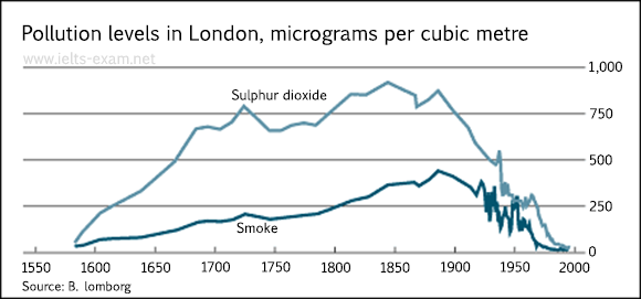
The graph shows pollution levels in London between 1600 and 2000. It measures smoke and sulphur dioxide in micrograms per cubic metre. According to the information, the levels of both pollutants formed a similar pattern during this period, but there were always higher levels of sulphur dioxide than smoke in the atmosphere.
In 1600, pollution levels were low, but over the next hundred years, the levels of sulphur dioxide rose to 700 micrograms per cubic metre, while the levels of smoke rose gradually to about 200 micrograms per cubic metre.
Over the next two hundred years the levels of sulphur dioxide continued to increase, although there was some fluctuation in this trend. They reached a peak in 1850. Smoke levels increased a little more sharply during this time and peaked in 1900 at about 500 micrograms. During the 20th century, the levels of both pollutants fell dramatically, though there was a great deal of fluctuation within this fall.
Clearly, air pollution was a bigger problem in London in the early 20th century than it is now.
Bài viết này đã cung cấp cho các bạn, đặc biệt các sĩ tử đang chuẩn bị dự thi IELTS cách viết Writing Task 1 Bar Chart hiệu quả nhất. Hy vọng bài viết sẽ thật sự hữu ích, đặc biệt với các bạn đang bắt đầu tìm hiểu về kỳ thi IELTS nói chung và Writing IELTS nói riêng. Ieltscaptoc.com.vn chúc bạn học tập tốt.

